In the third part of this mini-series, I will highlight college tennis alumni, who competed in the men’s doubles draw at the 2021 Australian Open. There were 21 total players with college tennis experience in the doubles draw, including 6 who also competed in the singles main draw. This is compared to 10 total college alumni in the singles draw. I don’t think the higher prevalence of ex-college players in the doubles draw is a coincidence.
There’s a couple of reasons for this. First, in NCAA Division 1 dual matches, the doubles point is contested before singles play starts. There are a few exceptions – such as if there is a chance of rain later on in the day – but for the most part, singles follows doubles. Having a 1:0 lead after doubles, and needing to win 3 instead of 4 singles matches to secure the team victory feels different, especially in dual matches between two evenly matched teams.
Furthermore, there may be limited court availability for practice at some schools, especially during the winter months. If a men’s team needs to share, say, four indoor courts with the women’s team, there will be a lot of doubles drills going on during practice. Finally, individual accolades are recognized in both singles and doubles at the college level, and are not judged through a different lens. At every school I’ve been to, being an All-American gets one’s name put up in a prominent location highlighting the history of the program, regardless if one is an All-American in singles or doubles.
Combine all those factors, and doubles is practiced more, contested with more intensity and, frankly, seriousness at the college level than at a lot of the junior and smaller professional tournaments. As a result, college players simply get more productive doubles reps during their stay in school, and are well prepared for the world of professional doubles upon graduation.
The players are listed in alphabetical order by last name.
Marcelo Arevalo, University of Tulsa
- College: 2011 Conference USA Player of the Year, 2011 NCAA Team Round of 16
- Professional: Career high #45 ATP doubles, 2020 & 2021 Australian Open doubles quarterfinalist
Arevalo spent three semesters at the University of Tulsa, and helped lead the team to its first ever appearance in the NCAA Round of 16 in 2011.
Andre Begemann, College of Santa Fe (NAIA)/Pepperdine

- College: 2006 NCAA Team Champions (with Pepperdine), 2006 NCAA Doubles Finalist (with Pepperdine)
- Professional: Career high #36 ATP doubles, #166 ATP singles
Begemann was part of the 2006 Pepperdine national championship team, and his singles victory clinched the title for Pepperdine in the finals against the Georgia Bulldogs. A week later, Begemann and his partner Scott Doerner made it all the way to the NCAA doubles final. He has won four doubles titles on the ATP tour as of this writing.
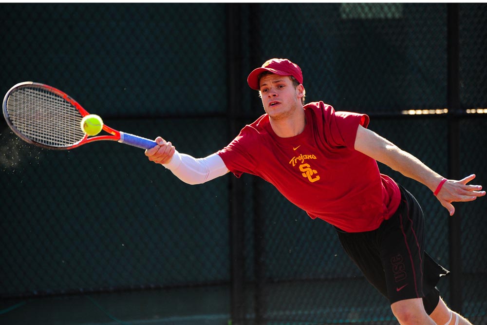
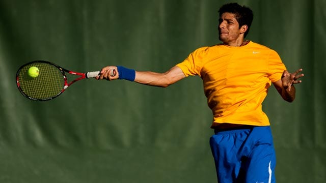
Robert Farah, University of Southern California
- College: 2009 & 2010 NCAA Team Champions, 2008 NCAA Doubles Champion
- Professional: Career high #1 ATP doubles, 2019 Wimbledon & US Open Doubles Champion
Before becoming a multiple Grand Slam champion and ranked #1 in the world in doubles, Farah was an outstanding college competitor at USC. He has been part of two national championship winning teams, won an NCAA doubles title, and finished his senior season ranked #1 in the NCAA individual singles rankings.
Yannick Hanfmann, University of Southern California
Andrew Harris, University of Oklahoma

- College: 2014 & 2015 & 2016 NCAA Team Finalists, 2017 NCAA Doubles Champion
- Professional: Career high #159 ATP singles, #245 ATP doubles
At the University of Oklahoma, Harris was part of Sooners teams that made the trip to the NCAA team final in three consecutive years. He finished his collegiate career by winning the 2017 NCAA doubles championship with teammate Spencer Papa. Harris is by no means a doubles specialist; as of this writing, he is ranked #225 in the ATP singles rankings while still being only 26 years old.
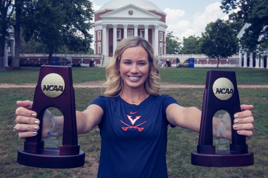
Dominic Inglot, University of Virginia
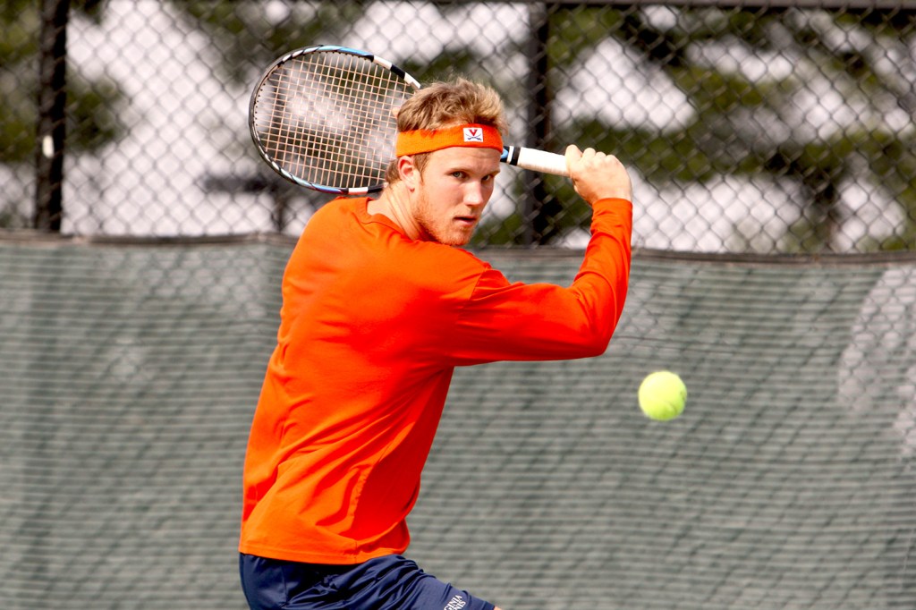
- College: 2007 & 2008 NCAA Team Quarterfinalists, 2009 NCAA Doubles Champion
- Professional: Career high #18 ATP doubles, 2015 US Open Doubles Semifinalist, 2018 Wimbledon Doubles Semifinalist
The Virginia Cavaliers have won the NCAA team national championship in 2013, 2015, 2016, and 2017. Inglot was at Virginia in the early stages of what was going to become a powerhouse program under head coach Brian Boland. His 2009 NCAA Doubles title with teammate Michael Shabaz was the first NCAA national championship of any kind for the Virginia men’s tennis team, and laid the foundation for the Cavaliers’ future accomplishments.
Ben McLachlan, University of California-Berkeley
- College: 2011 & 2012 & 2013 & 2014 NCAA Team Round of 16
- Professional: Career high #18 ATP doubles, 2018 Australian Open Doubles Semifinalist
Nicholas Monroe, University of North Carolina

- College: 2004 All-American, ranks 2nd in all time singles wins at North Carolina
- Professional: Career high #30 ATP Doubles, 2017 US Open & 2020 French Open Doubles Quarterfinalist
Nick Monroe played for the North Carolina Tar Heels from 2000 – 2004. As an interesting tidbit – Monroe’s first professional main draw doubles match came at a Futures event in 2001, where his partner was the current associate head coach of the Tar Heels, Tripp Phillips.
John Peers, Middle Tennessee State/Baylor University
- College: 2011 NCAA Team Quarterfinalists (with Baylor), 2011 Doubles All-American (at Baylor)
- Professional: Career high #2 ATP Doubles, 2017 Australian Open Doubles Champion, 2015 Wimbledon & US Open Doubles Finalist
John transferred to Baylor University for his senior season, and played mostly #1 singles and #1 doubles in his lone season of action for the Bears. I’m happy to call John a friend, and he is a very competitive, driven individual, as well as an outstanding athlete. An observation I had at Baylor was that John spent time practicing volleys from a variety of positions on the court during every individual practice. The majority of players spend a lot of practice time grooving their groundstrokes, and volleys can be an afterthought. As a result, John’s comfort level at the net was as high as anyone’s, already during his college days.
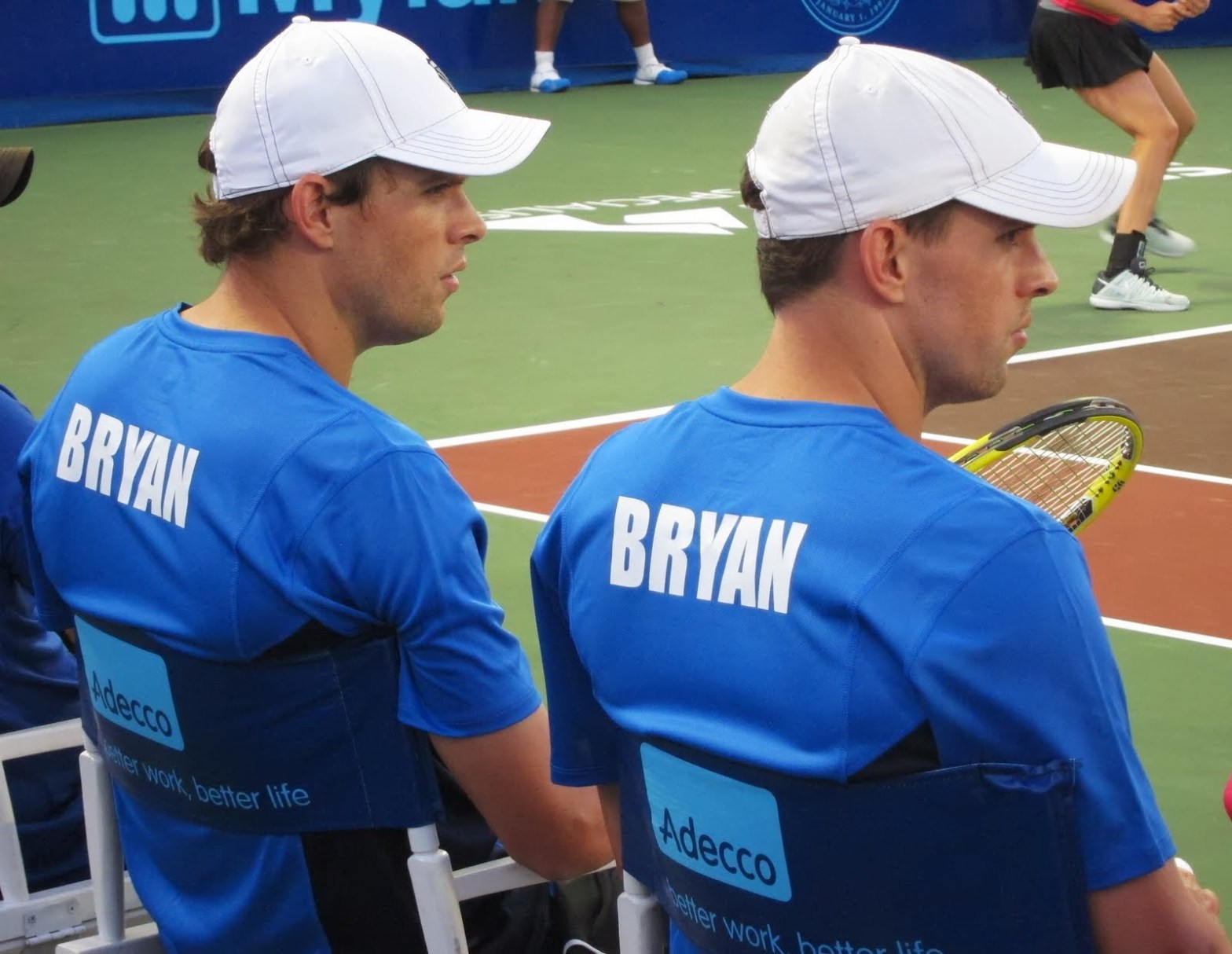
Rajeev Ram, University of Illinois
- College: 2003 NCAA Team Champions, 2003 NCAA Doubles Champion
- Professional: Career high #5 ATP doubles, 2020 Australian Open Doubles Champion, 2021 Australian Open Doubles Finalist
Rajeev Ram only spent one semester at the University of Illinois – the spring of 2003 – but that semester could not have gone much better. The 2003 Illini went a perfect 32-0, winning the ITA Indoor National Championship, the NCAA Team National Championship, and their players won the NCAA Singles individual title, as well as the NCAA doubles title (Ram won the doubles championship with his teammate Brian Wilson).
Joe Salisbury, University of Memphis

- College: Career high #3 ITA doubles; University of Memphis all-time doubles wins leader
- Professional: Career high #3 ATP doubles; 2020 Australian Open Doubles Champion, 2021 Australian Open Doubles Finalist
Joe Salisbury and Rajeev Ram have been doubles partners in the last two Australian Opens, winning the title in 2020, and losing in the final in 2021. Salisbury is one of a number of good British players, who have competed for the Memphis Tigers in the past few years. He still holds the record for the most career doubles matches won at Memphis with 97.
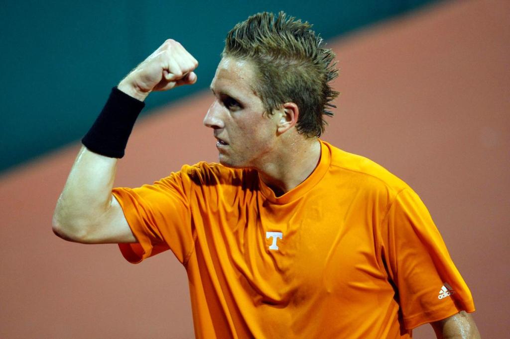
Tennys Sandgren, University of Tennessee
Ken Skupski, Louisiana State University

- College: 2-time Singles All-American, 1-time Doubles All-American, 2005 NCAA Doubles Finalist
- Professional: Career high #44 ATP doubles, 2017 Wimbledon & 2020 Australian Open doubles quarterfinalist
Neal Skupski, Louisiana State University
- College: 1-time Singles All-American, 3-time Doubles All-American, 2012 NCAA Singles Quarterfinalist
- Professional: Career high #26 ATP doubles, 2019 US Open doubles semifinalist, 2017 Wimbledon & 2020 French Open doubles quarterfinalist
Neal followed in his brother’s footsteps, attending LSU in Baton Rouge, Louisiana before embarking on his professional career. He was the first player in LSU men’s tennis history to earn the All-American doubles status as a freshman, and finished his LSU career with 75 singles and 87 doubles wins. The Skupski brothers often play doubles together on the ATP tour; they were the #16 seeds at the 2021 Australian Open.
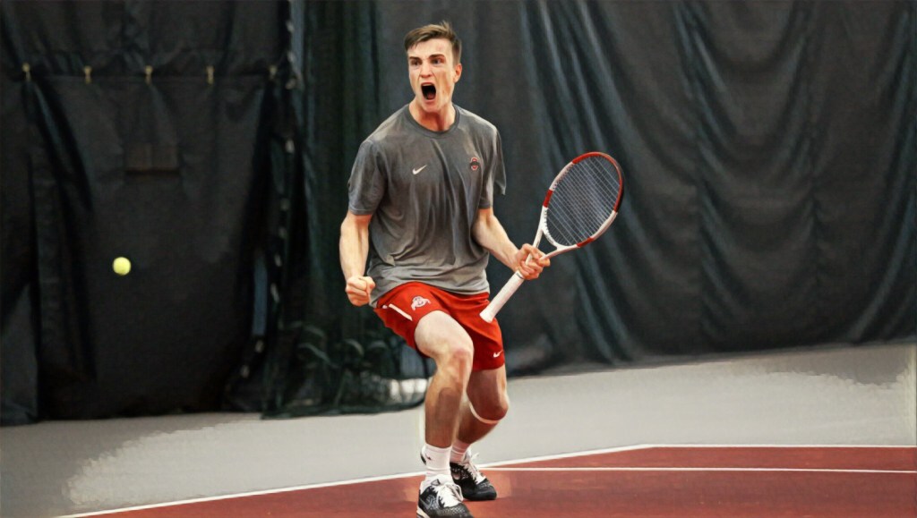
John-Patrick Smith, University of Tennessee

- College: 2010 NCAA Team Finalists, 8-time(!!) All-American
- Professional: Career high #52 ATP doubles, 2017 US Open & 2021 Australian Open doubles quarterfinalist
JP Smith is simply one of the most decorated athletes in the University of Tennessee’s storied history. He is one of only three players to achieve a singles AND doubles All-American status in four consecutive years, the others being Rick Leach at the University of Southern California, and current North Carolina Tar Heel William Blumberg. Besides leading his team to the NCAA team final in 2010, while playing line #1 singles and doubles, Smith was also named the 2011 SEC Athlete of the Year. In a football-crazed conference such as the SEC, that qualifies as the rarest of feats.
Michael Venus, University of Texas/Louisiana State University

- College: 2009 Singles & Doubles All-American (at LSU)
- Professional: Career high #8 ATP doubles, 2017 French Open doubles champion
Joran Vliegen, East Carolina University
- College: 2014 Conference USA Player of the Year, first player in East Carolina history to earn an individual singles ranking
- Professional: Career high #35 ATP doubles, 2019 French Open & 2020 US Open doubles quarterfinalist
Vliegen went to a smaller school outside of the traditional “Power 5” conferences, yet he still used his time in college as a preparation for the professional tour and was a trailblazer at his school. At East Carolina, Vliegen was the first player to earn an individual singles ranking, the first player to appear in the NCAA singles tournament, as well as being one half of the first pair to appear in the NCAA doubles tournament.